May 2025 | DESIGN & INTERIORS
DRAPED in ILLUSION: LEE BROOM’s OVERTURE
words Onur Basturk
photos William Jess Laird
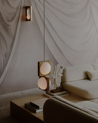
Lee Broom’s signature blend of theatrical elegance and sculptural design takes on a new form—this time, across the walls. In his first-ever wallpaper collaboration, the acclaimed British designer joins forces with Calico Wallpaper to create Overture, a collection that transforms a two-dimensional surface into a three-dimensional stage, continuing Broom’s long-standing fascination with illusion and drapery.
Channelling everything from his childhood spent in the theatre to his student years at Central Saint Martins—and more recently, his acclaimed Requiem lighting series—Broom brings deeply personal references to this new medium. With Calico’s artistic sensibility and cutting-edge technical approach, Overture becomes more than a decorative element; it’s a visual narrative, a surface that behaves like a curtain ready to rise on a performance.

CALICO WAS THE IDEAL COLLABORATOR
This is your first wallpaper collaboration – why now? What made Calico Wallpaper the right partner to bring Overture to life?
This felt like the right moment to explore a new medium that could bring some of my long-standing ideas around illusion into a different context. Calico was the ideal collaborator, as their approach to wallpaper is deeply artistic, and their ability to merge traditional techniques with advanced technology made it possible to realise this vision. Their ethos of creating immersive, transformative surfaces aligned perfectly with what I wanted Overture to be—and with my own work. Calico is a great brand to work with; I’ve always been a fan and have known them for many years, so when they asked me, I had to say yes.
DRAPERY HAS A NATURAL THEATRICALITY TO IT
You've spoken about your early connection to theatre and drapery as a child actor. How did those formative memories shape the creative process behind this collection?
My experiences in the theatre as a child actor had a lasting impact. I was always fascinated by the way set designers could use simple materials like fabric and light to create entire worlds on stage. One of my favourite memories of being in shows is after the first few weeks of rehearsals, when the set designer would come in and present a miniature version of the full stage design to the cast and talk us through how the scenery would evolve throughout the performance. With Overture, I drew on those memories, thinking about how drapery can suggest movement, emotion, and illusion.
From Requiem's sculptural lighting to Overture's illusionistic wallpaper, drapery has been a recurring theme in your work. What keeps drawing you back to this motif?
Drapery has a natural theatricality to it. It’s expressive, fluid, and full of suggestion. I’ve worked with it in many forms—from early installations in bars and restaurants during my student days to sculptural lighting pieces like Requiem. There’s something endlessly fascinating about its ability to appear soft and flowing, even when cast in solid materials. One of the key things that attracted me to this collaboration was the opportunity to present this medium in a very different way—giving the impression of fluid drapery while actually being something else entirely.

IT’S NOT JUST WALL COVERING —IT’S ESSENTIALLY AN ART PIECE
Overture transforms a flat surface into something almost architectural and immersive. How did you approach the challenge of making wallpaper feel spatial and alive?
The idea was to take something inherently flat and give it the illusion of depth and movement. We used scale, light, and shadow to create that sense of dimension. I sketched out the original design, and then we had an artist hand-paint the entire wall covering. From a distance—or in a photograph—it looks real, but as you get closer, you can see all the brush marks of the paint. It almost has an impressionist quality to it, which I love. Working with Calico’s team and their technical processes allowed us to push the design into a more sculptural realm, making the wallpaper feel like it’s part of the architecture rather than simply applied to it.
The names of the seven colourways—like Matinee, Recital, and Auditorium—evoke theatrical scenes. How important was storytelling in how you developed this series?
Storytelling is always important to me in any of my designs. This collaboration in particular felt like it needed a very strong narrative from the outset. Once installed in someone’s home, the wallpaper is obviously a very prominent element of the interior—and in some ways, it dictates the overall space. That’s why it's important to have a story behind it. It gives the customer or client the ability to tell their friends or loved ones the history, the craftsmanship, and the concept behind the design. It’s not just wall covering—it’s essentially an art piece.
Your work often sits at the intersection of art, design, and experience. What does this project say about the future of surfaces and how we live with them?
For me, I don’t see why furniture, lighting, or surface finishes in an interior shouldn’t evoke the same emotions and conversations that art does within a space. I find it a little absurd that you could be at someone’s home for dinner and spend time discussing a painting—who created it, when it was conceived, the story behind it—while you’ve been sitting on a chair or at a table that no one has mentioned, or at least not with the same passion. I see surfaces, lighting, and furniture becoming part of a more emotive conversation—not just serving a functional purpose.


